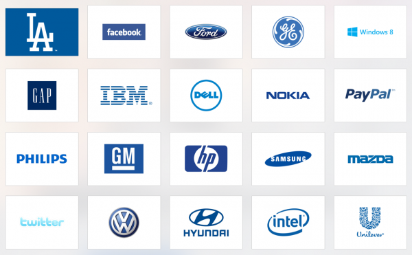
In our 20-year history of building brands I’m proud to say that only about 15 percent of the the companies we’ve worked with chose blue as their flagship color. When you consider the global average of 60 percent, it’s a figure that’s surprisingly below the norm. But, then again, it makes sense when you consider that most companies that choose to work with 20|20 aren’t doing so because they want to stay in the middle of the pack.
But before we get ahead of ourselves, what’s so wrong with blue? The world’s favorite color, it’s calming, soothing, secure and safe. So what gives?
An article published by Fast Company that caught our attention says it best:
“Blue is cited as the “most popular” color among both men and women. This means blue, as a brand color, is likely the easiest color for groups of people to agree on. If a blue brand is an indicator of a consensus-driven culture, might that also mean that those cultures are essentially self-made for the middle…less inclined toward the big risks and bold moves so evident in more dictatorial market leaders.”
But the article also suggests the blue isn’t just middle of the road, but that it actually underperforms too:
Personally I don’t know if I’m wholly sold on the connection between a winning team and their uniform color, but maybe that’s why losing usually comes with a case of the “blues”?
– Alec
(favorite color: green)