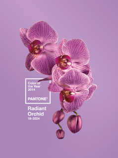
 The dawn of a New Year brings one of my favorite milestones: Pantone’s Color of the Year. The principal on all things pigment has selected Wild Orchid as the optimal hue for 2014 (PANTONE 17-5641 to be exact). While 2012’s Tangerine Tango screamed energy and 2013’s Emerald connoted growth (financial and otherwise), this creamy purple beckons us to do something foreign to many of us lately: dream.
Economically speaking, many of us have been working tirelessly to make headway beyond just recovery. Now is the time, according to Pantone, to pause and indulge your curiosity and imagination that can take us further. To me, it also symbolizes compromise, finding a middle ground between warm and cool tones that results in something poised, yet playful at the same time.
Pantone characterizes this year’s annual selection as such: “An enchanting harmony of fuchsia, purple and pink undertones, Radiant Orchid inspires confidence and emanates great joy, love and health. It is a captivating purple, one that draws you in with its beguiling charm.”
Whether in fashion, art, or the home this year, I’m excited for this purple tone to inject a little whimsy and genuine delight into the world around us.
Extra Credit
Check out an artist’s delicious interpretations on striking Pantone shades straight from the kitchen. Yum!
Cheers,
Robyn