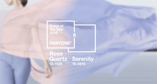
For the first time, Pantone’s Color of the Year is a union of two shades- the airy pink Rose Quartz and the calming lavender Serenity. While 2015 channeled the rich and luxurious Marsala, 2016 focuses on “mindfulness and well-being as an antidote to modern day stresses.” In today’s tumultuous, fast-paced world, these colors are a gentle reminder for us to take time out of our busy lives to rest and rejuvenate our minds and bodies.
According to Pantone, “Rose Quartz and Serenity demonstrate an inherent balance between a warmer embracing rose tone and the cooler tranquil blue, reflecting connection and wellness as well as a soothing sense of order and peace.”
Though pink and purple hues aren’t my personal cup of tea, I can definitely get behind the meaning for their selection. With stress from our lives already piling up, it’s a good idea to take a step back every now and then this year to nurture your body and soul. I think you’ll find me having a massage and a good soak in the heated sulfuric water at Sycamore Mineral Springs or simply catching some sun at one of the many wonderful beaches across the Central Coast.
Whatever your mode to relaxation may be, I hope it brings you peace and serenity in 2016.
Cheers,
Meg